From Cognitive Overload to
Actionable
Clarity.
Leading the UX/UI strategy and design system architecture to transform a data-heavy institutional banking platform into an intuitive decision-making tool.
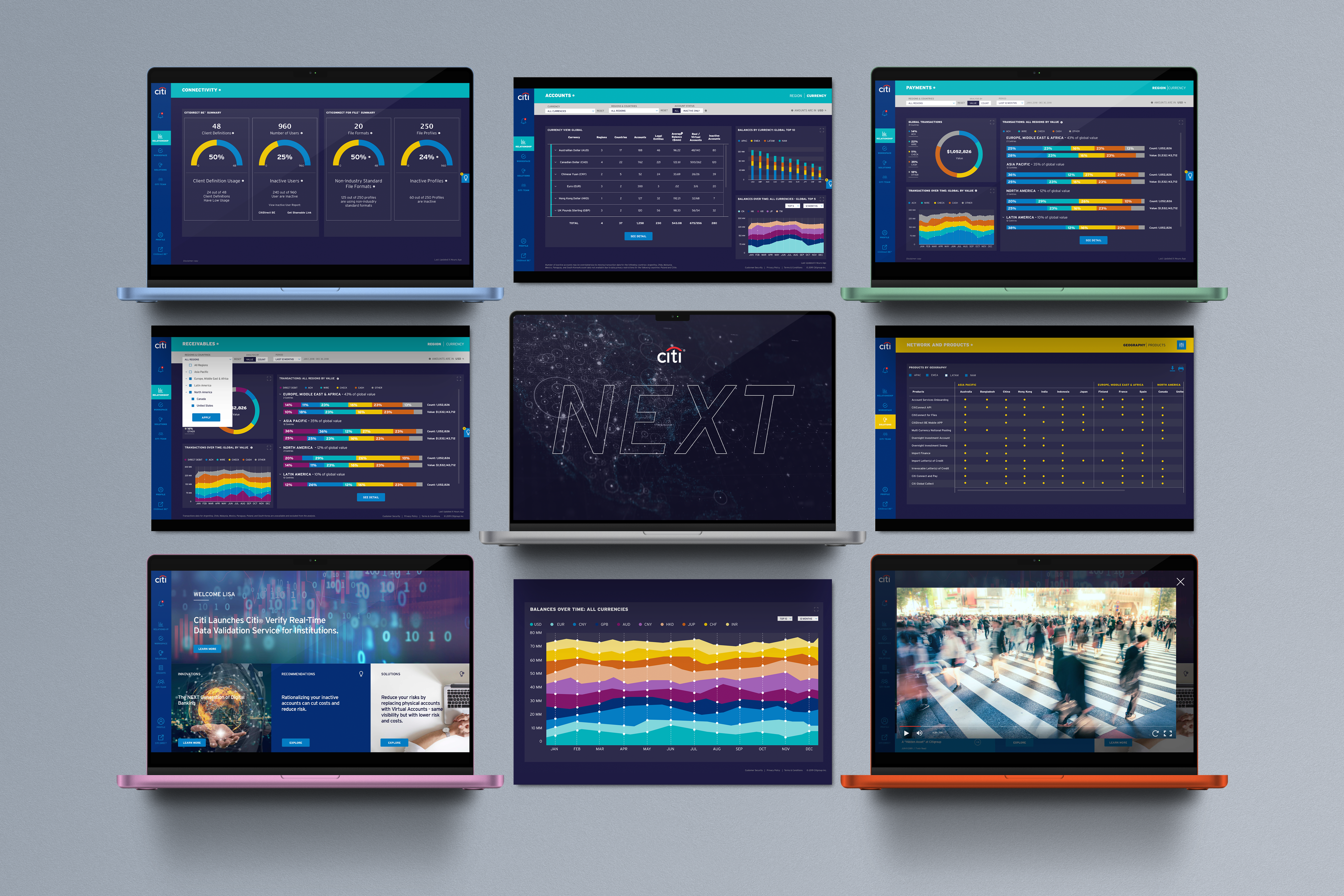
Enterprise Data Visualization — Translating high-volume global transaction data into a scannable, action-oriented dashboard for corporate executives.
Project Overview
-
Role
Lead UX/UI Designer (Strategy, UI Overhaul, Design System)
-
Team
Cross-functional collaboration with Citi Product, Content, Frameworks/Dev, and Infosys Business Analysts.
-
Core Focus
Enterprise Data Visualization, Multi-faceted Information Architecture, Design Tokens & Component Libraries.
The Context & Challenge
Citi NEXT is a premier digital platform designed for institutional clients (CFOs, Treasurers) managing global assets. However, visualizing massive amounts of financial data across multiple regions presented significant structural challenges.
Cognitive Overload
Users logging in were met with an overwhelming volume of unprioritized data. Identifying critical actions—such as idle cash across global accounts or emergency payment statuses—was like finding a needle in a haystack.
IA Complexity
The platform needed to house hundreds of financial products across varied geographical regions (APAC, EMEA, LATAM) without burying them under deep, complex navigation trees.
The Goal
To deliver a unified MVP that seamlessly surfaces critical financial health metrics, establishes a scalable design system for future modules, and balances strict technical feasibility with UX best practices.
The "Balancing Act" Strategy
Designing for enterprise fintech requires more than just aesthetics; it requires rigorous systems thinking. I led an intensive UI workshop to align diverse global stakeholders and established a decision-making framework.
STEP 01 Alignment & Framework
The Alignment Workshop
I facilitated working sessions with Product, BA, and Dev teams to audit the existing wireframes, identifying critical friction points in the data presentation and user flows.
The 6-Pillar Decision Framework
To objectively evaluate every UI update, I introduced a balancing framework. Every design decision had to satisfy six dimensions:
- Business Requirements
- Tech Feasibility (Ensuring components could be built within MVP timelines)
- UX/UI Best Practices
- Maintenance & Sustainability (The foundation of our Design System)
- Intent of Screen Content/Data (Does the chart actually help the user make a decision?)
- Aesthetics
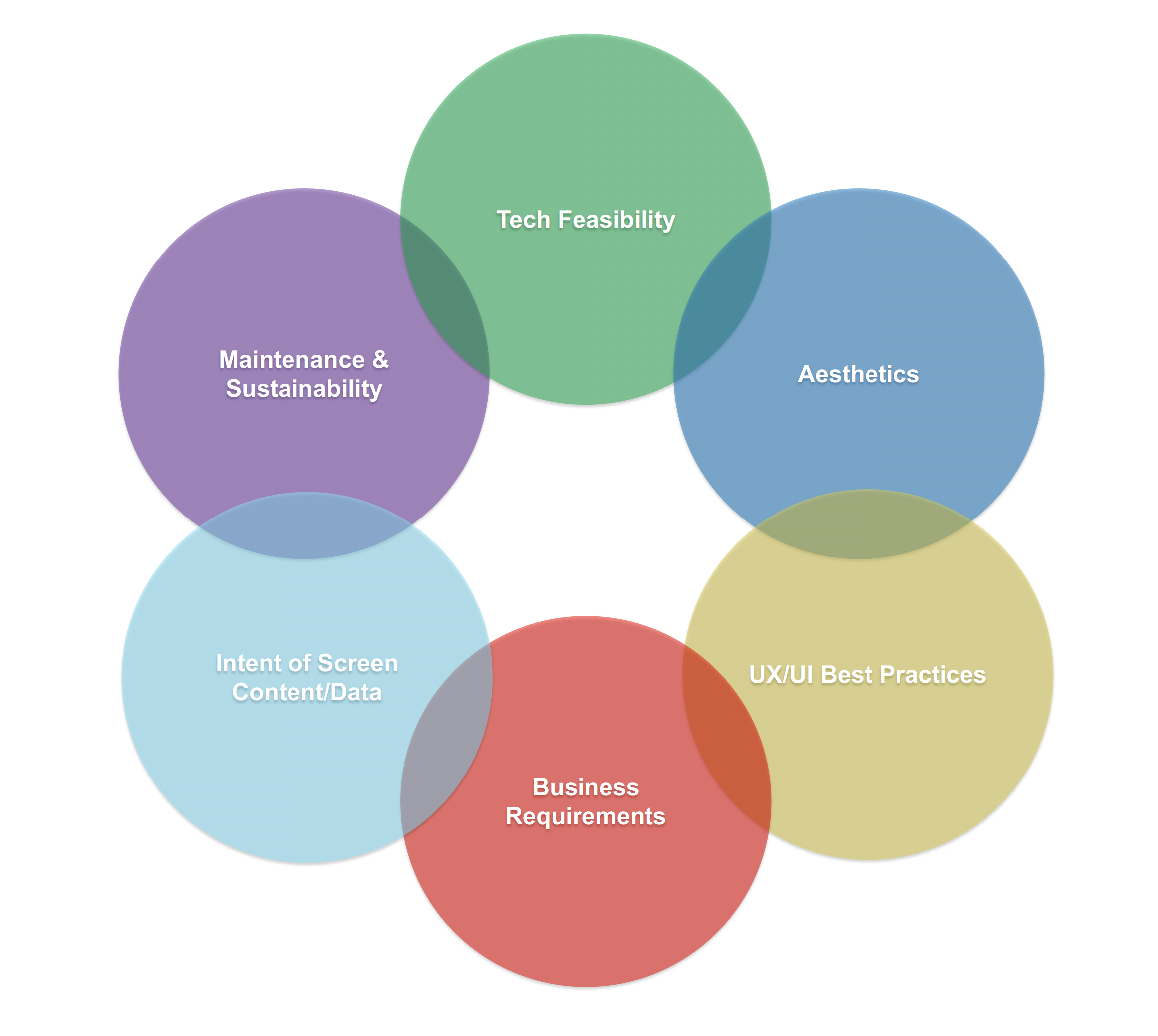
Establishing a 6-pillar decision framework to align cross-functional stakeholders and balance technical constraints with user-centric design.
Advanced Data Viz & Scalable Architecture
To solve the complexity of global financial management, we moved from a "data-dump" model to a highly curated, visual-first experience.
Feature 01: Adaptive Data Visualization
// Payments & Receivables
Treasurers need to quickly assess the health of their global payments and identify bottlenecks across multiple regions simultaneously.
After exhaustively testing various data visualization models against engineering constraints, I determined that the Horizontal Stacked Bar Chart combined with modular Data Cards was the optimal solution.
To prevent misinterpretation of complex data, I consolidated the global transactions from multiple scattered charts into a clean, unified dashboard. I utilized semantic color-coding and introduced contextual "Info Blurbs" to clarify how to read complex regional transaction data, allowing users to grasp millions of dollars in account activity at a single glance.
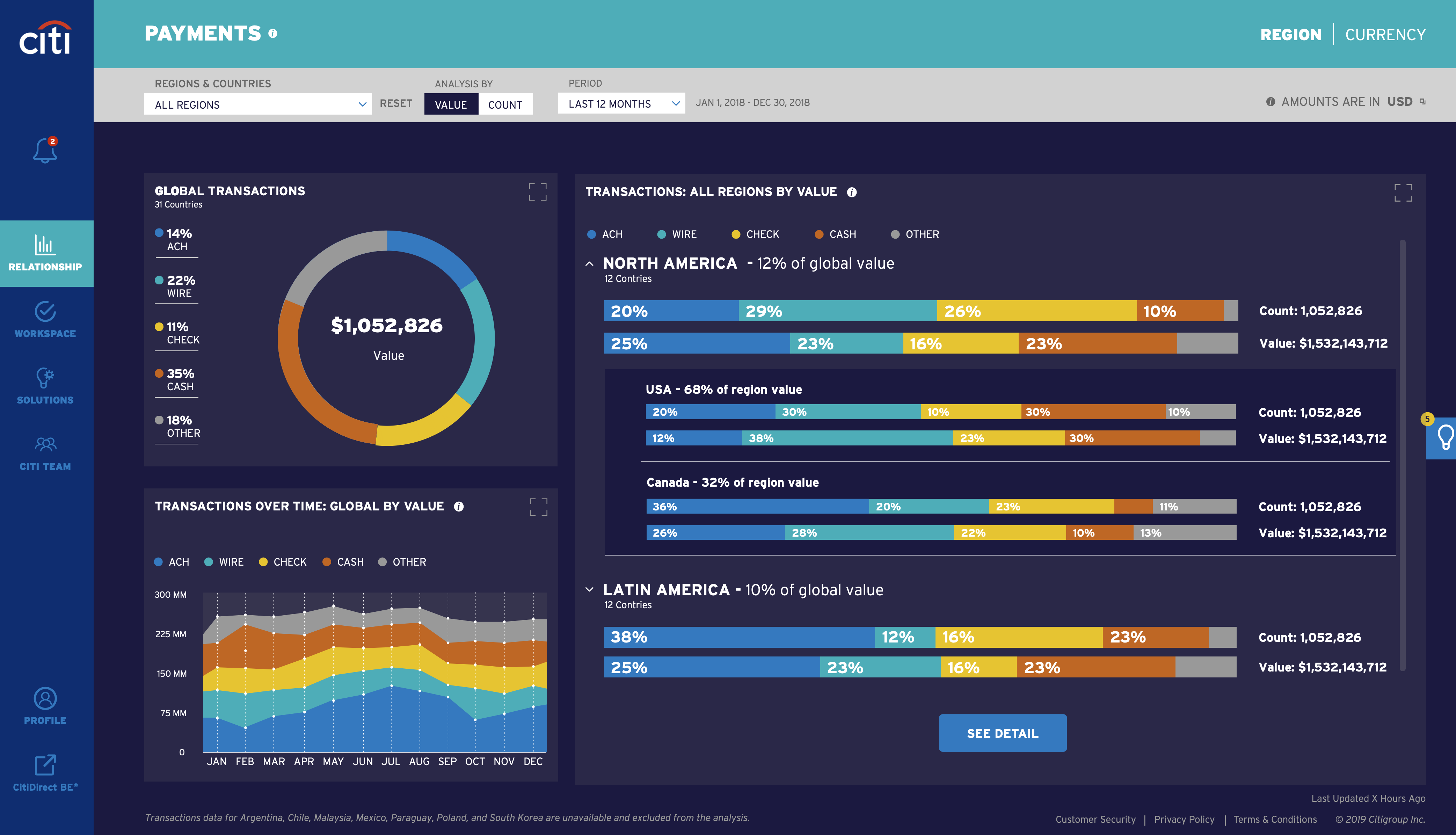
Balancing data density and technical feasibility: Utilizing horizontal stacked bar charts and semantic color tokens to clarify complex regional transaction data.
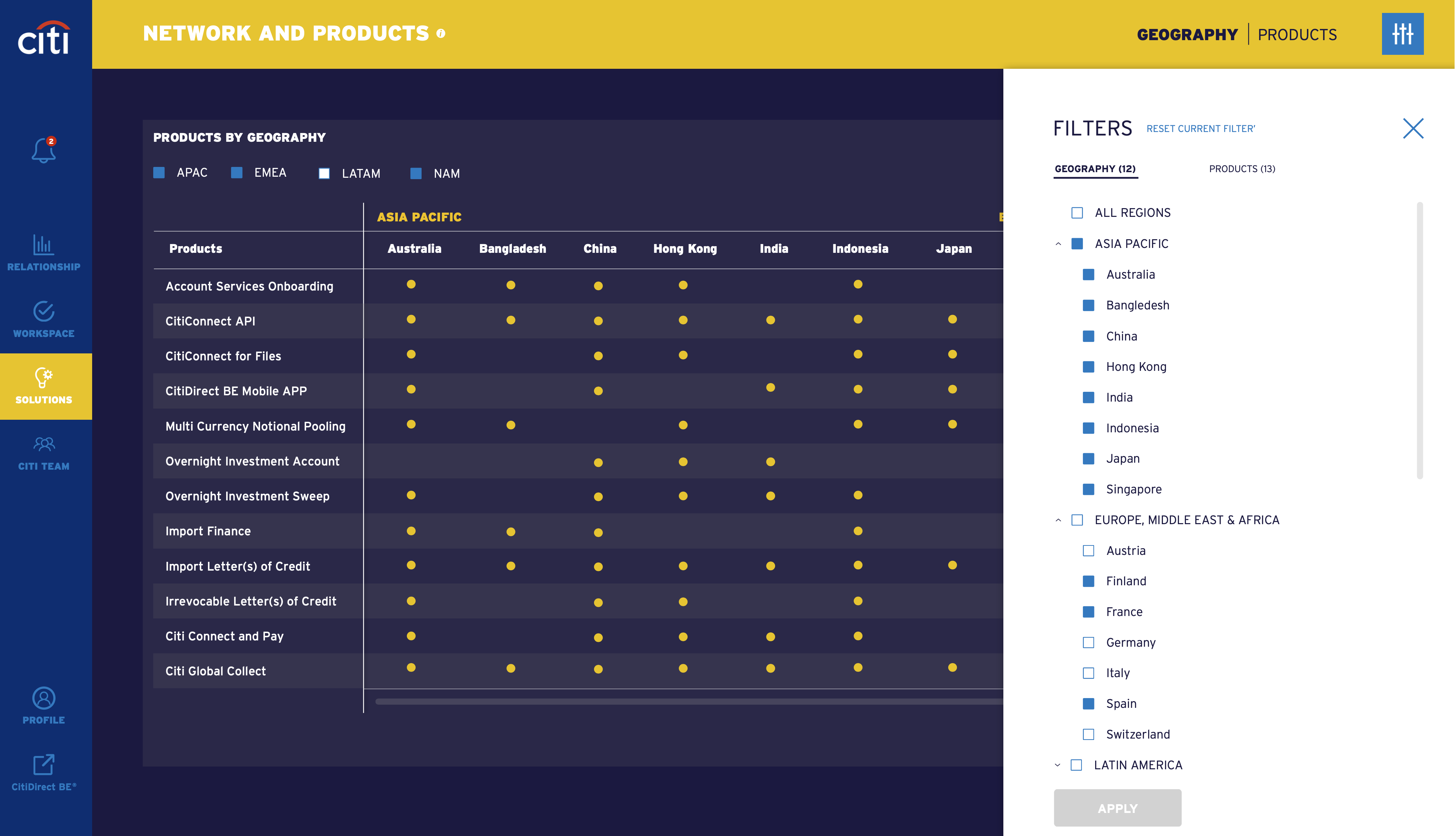
Designing a scalable multi-faceted filtering system to navigate hundreds of global financial products effortlessly.
Feature 02: Multi-Faceted Filtering
// Global Exploration
Users needed to find specific financial solutions (e.g., "Virtual Accounts") filtered by regions like "Asia Pacific" or "Latin America."
I architected a robust multi-faceted side-panel filter. It allowed users to cross-reference "Geographies" with "Products" seamlessly, turning a previously deep, multi-page click journey into a fluid, single-page exploration.
Feature 03: ROI Visualizer
// Data-Driven Nudges
Identifying inactive accounts or idle cash isn't enough; we needed to persuade CFOs to take immediate action to resolve them.
I transformed a static notification into an interactive Potential Benefit Visualizer. I designed a benchmark chart comparing the client’s inactive account ratio against the "Average Citi Client."
Beside the chart, I introduced a visual ROI equation:
By visualizing the exact dollar amount they were losing (e.g., $132,900), we significantly increased the click-through rate to the "Add to task list" CTA.
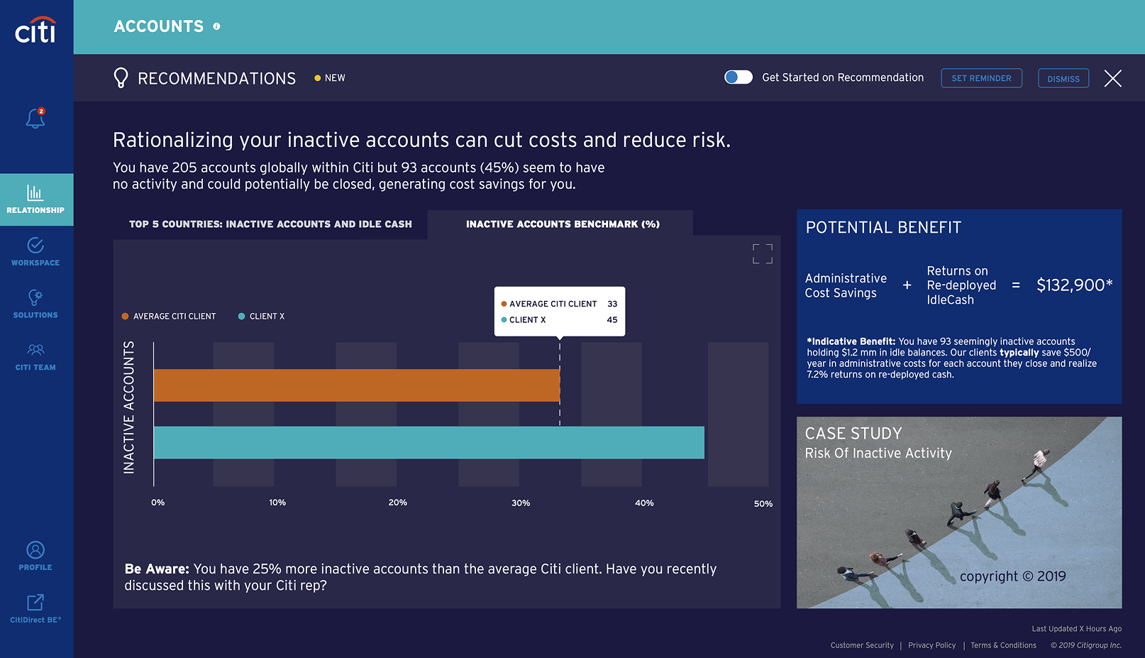
Driving user action by translating raw account data into a clear visual ROI equation and comparative industry benchmarks.
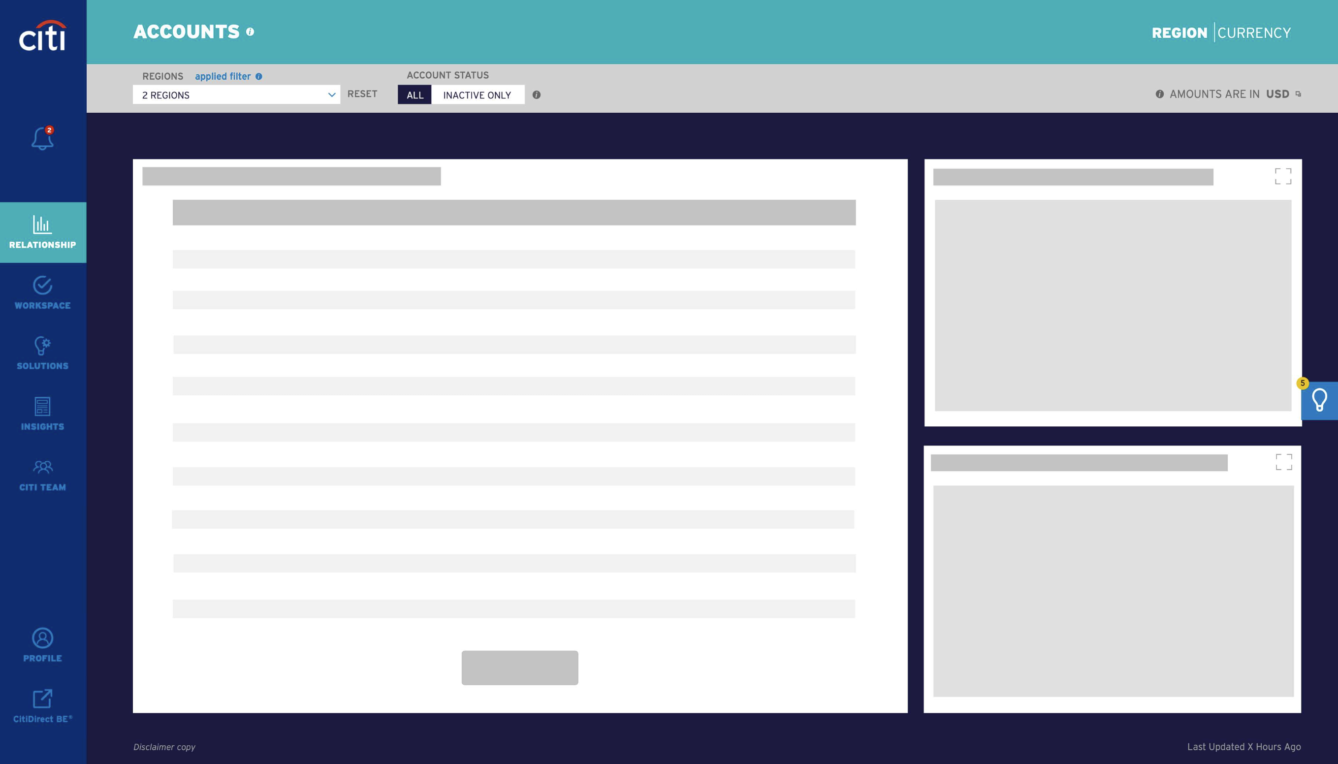
Implementing Skeleton UI patterns for heavy data-tables and charts to reduce perceived latency and maintain user context.
Feature 04: Perceived Performance
// Skeleton UI
Fetching millions of data points across global accounts naturally involves latency. A blank screen or a simple loading spinner would increase user bounce rates.
I established a standard Skeleton UI pattern across the entire platform. By progressively loading the structural wireframes of large data tables and graph components before the data populates, we dramatically improved the perceived performance of the platform during complex API calls.
Building for Scale
Beyond individual screens, the true value of the UX overhaul was establishing a sustainable foundation.
Phase 1: Contextual Onboarding
The Strategy
A user logging in for the first time has different emotional needs than a daily user.
- 1st Time Visitor: Greeted with a personalized "Welcome Splash" explaining the platform's value proposition.
- Repeat Visitor: Bypasses the splash and goes directly to the actionable Dashboard to save time.
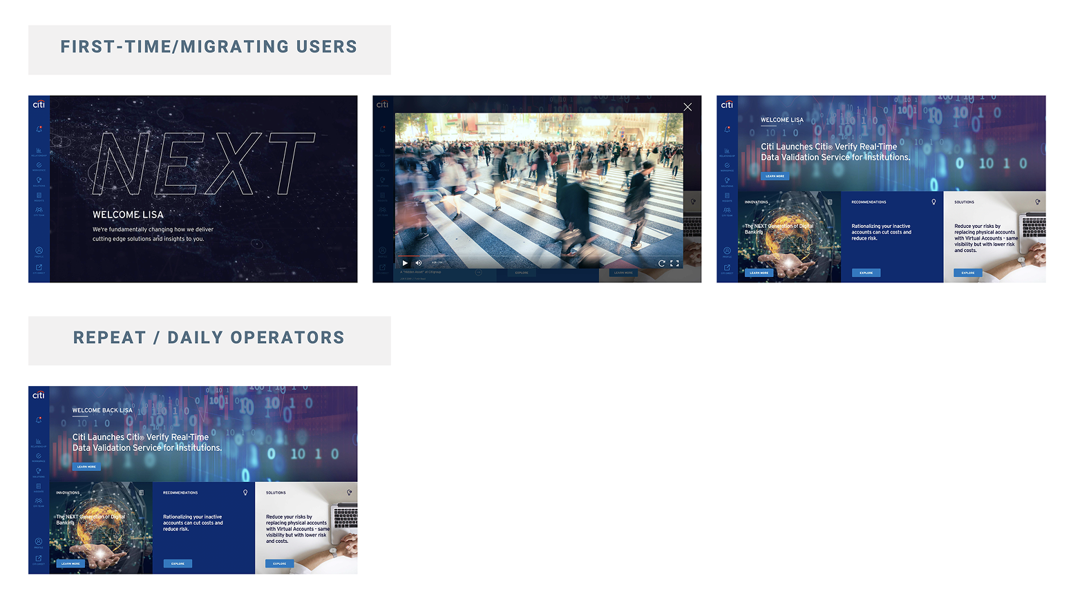
Context-aware routing prioritizing education for new users and efficiency for returning executives.
Phase 2: The Design System & Developer Handoff
The Foundation
To ensure "Maintenance & Sustainability," I spearheaded the creation of a foundational UI component library.
The Execution
By establishing strict Design Tokens (semantic colors for data states like error/success/warning, typography scales, and grid spacing), we ensured that future feature rollouts across different global regions would maintain a 100% uniform digital experience.
Bridging Design & Engineering
Instead of just handing over static screens, the design system was paired with comprehensive UI annotations. By clearly documenting chart visualization logic, responsive behaviors, and token usage, we drastically reduced engineering debt and QA cycles.
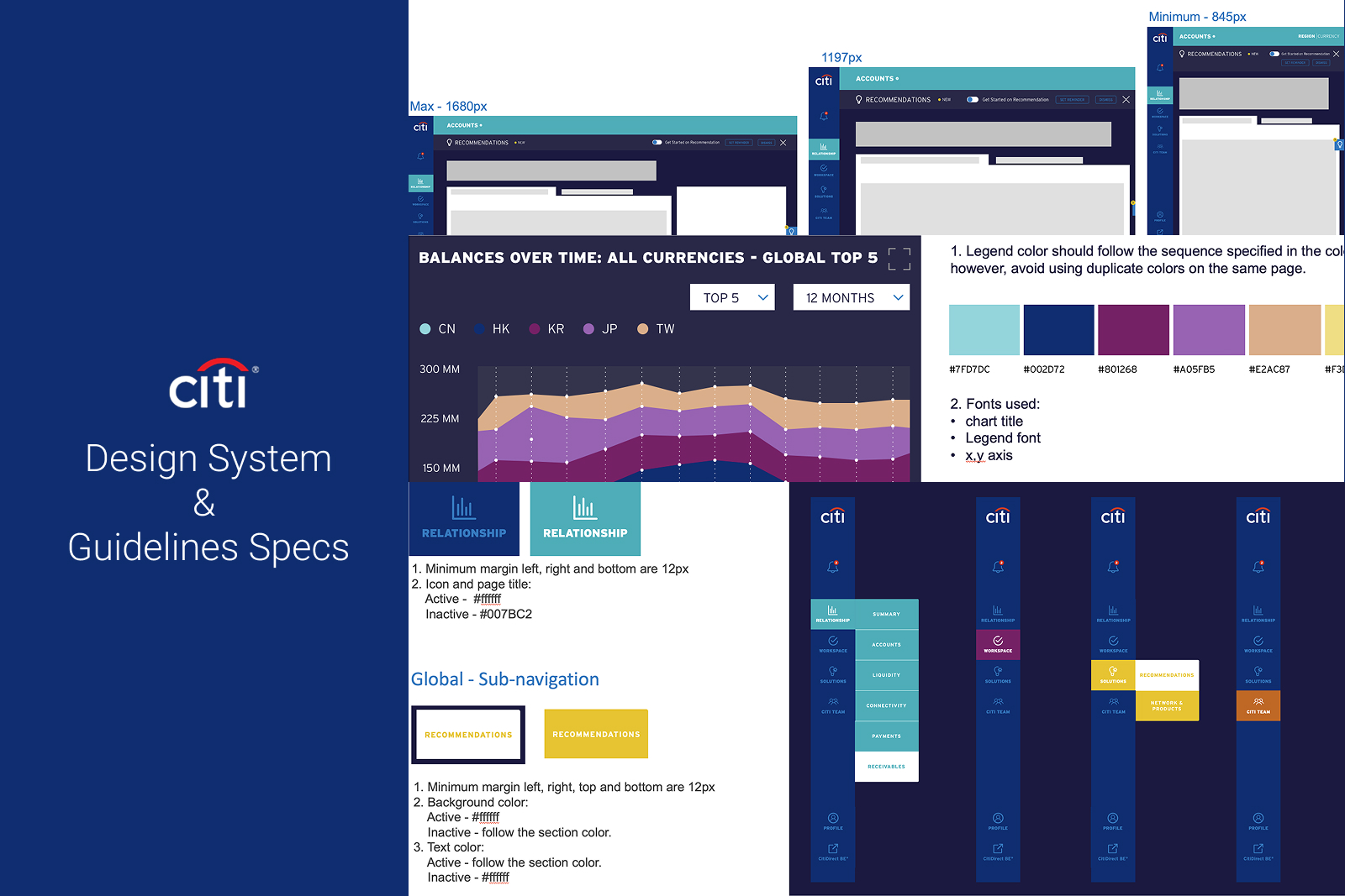
Establishing a foundational component library and structured handoff guidelines to ensure a uniform digital experience and accelerate development cycles.
The Impact
Executive Sign-off
Successfully secured formal approval from the high-level Operating Committee for the MVP release.
Enhanced Decision Making
Reduced cognitive load for end-users by organizing complex global data into a scannable, visually prioritized hierarchy.
Future-Proof Scalability
The introduction of design tokens and a unified component library laid the groundwork for rapid, consistent feature deployment across all global markets.