From "Black Hole" to
Single Source of Truth.
Leading the end-to-end product strategy to digitalize Verizon’s complex promotion lifecycle, transforming manual chaos into a streamlined digital ecosystem.
Role & Scope
-
Lead Product Designer
End-to-End Owner
-
Strategy
"Immersion First" Approach
-
Focus
Enterprise Workflow Digitization
The Challenge: The "Black Hole"
Verizon launches thousands of device offers annually. Each stream operated on different timelines and utilized disparate spreadsheets. Stakeholders described the process as a "Black Hole" — once a brief was sent, its status was unknown until it was too late.
Fragmented Workflow
DM, Finance, and RA teams operated in silos, juggling 6+ different Excel formats.
Data Integrity Risks
Manual copy-pasting of SKUs and Market IDs led to costly billing errors.
Immersion & Discovery
Unlike typical agency handoffs, I owned the product definition. I conducted deep-dive interviews with 17 stakeholders across Marketing and Finance. We uncovered granular pain points—such as the "Connected Car" team managing offers via verbal edits.
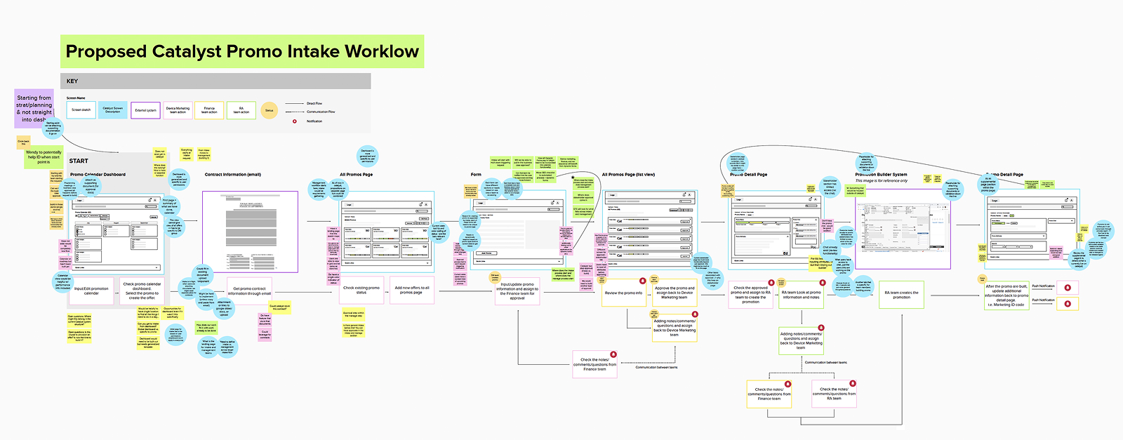
The "Crawl, Walk, Run" Roadmap
Given the massive scope, I worked with the Tech Lead to define a phased rollout strategy to ensure adoption and technical feasibility.
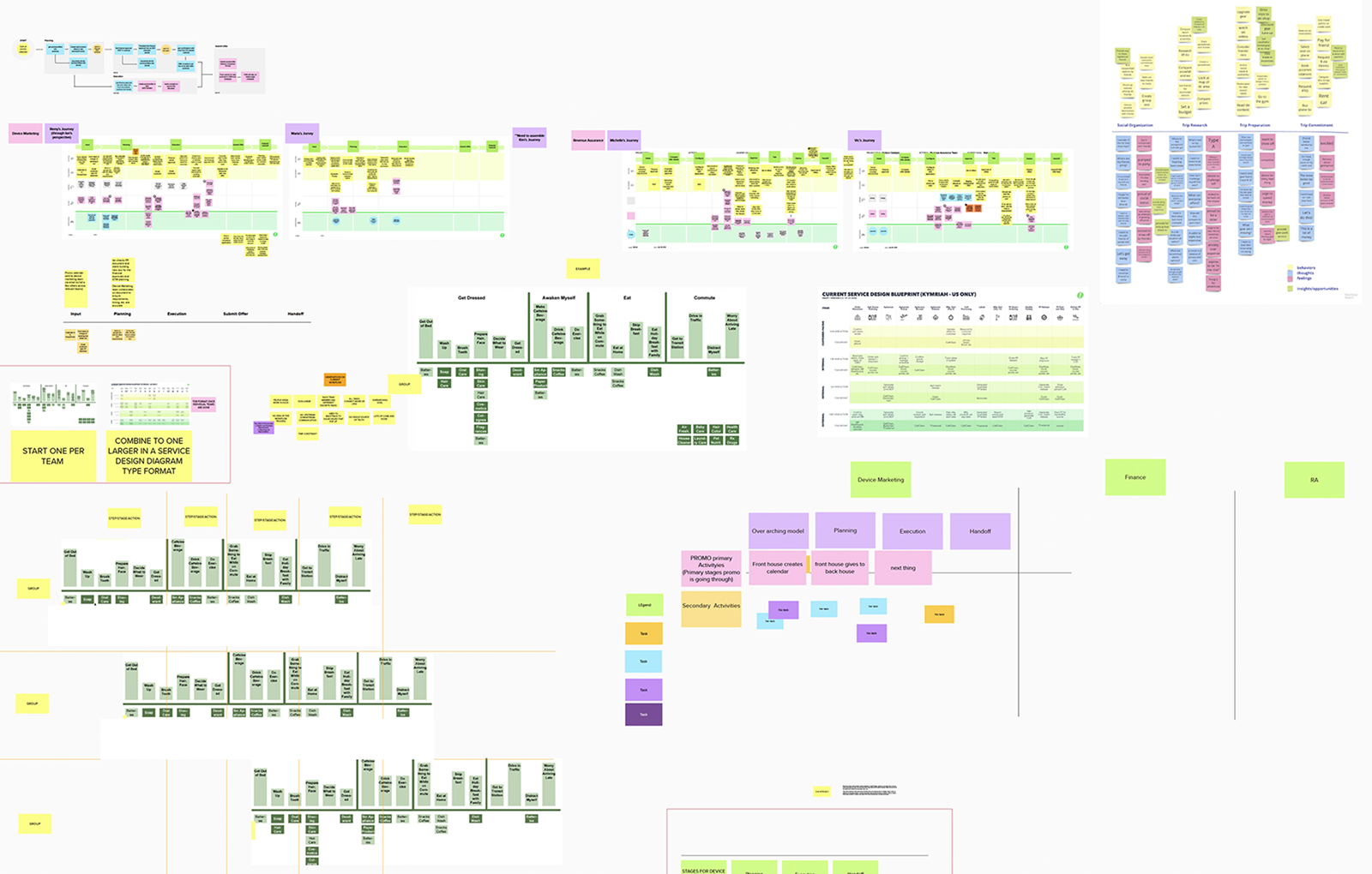
Taming Complexity
Before designing pixels, we had to untangle the logic. I created detailed service blueprints to visualize the invisible dependencies between departments, identifying opportunities to cut redundant steps by 30%+.
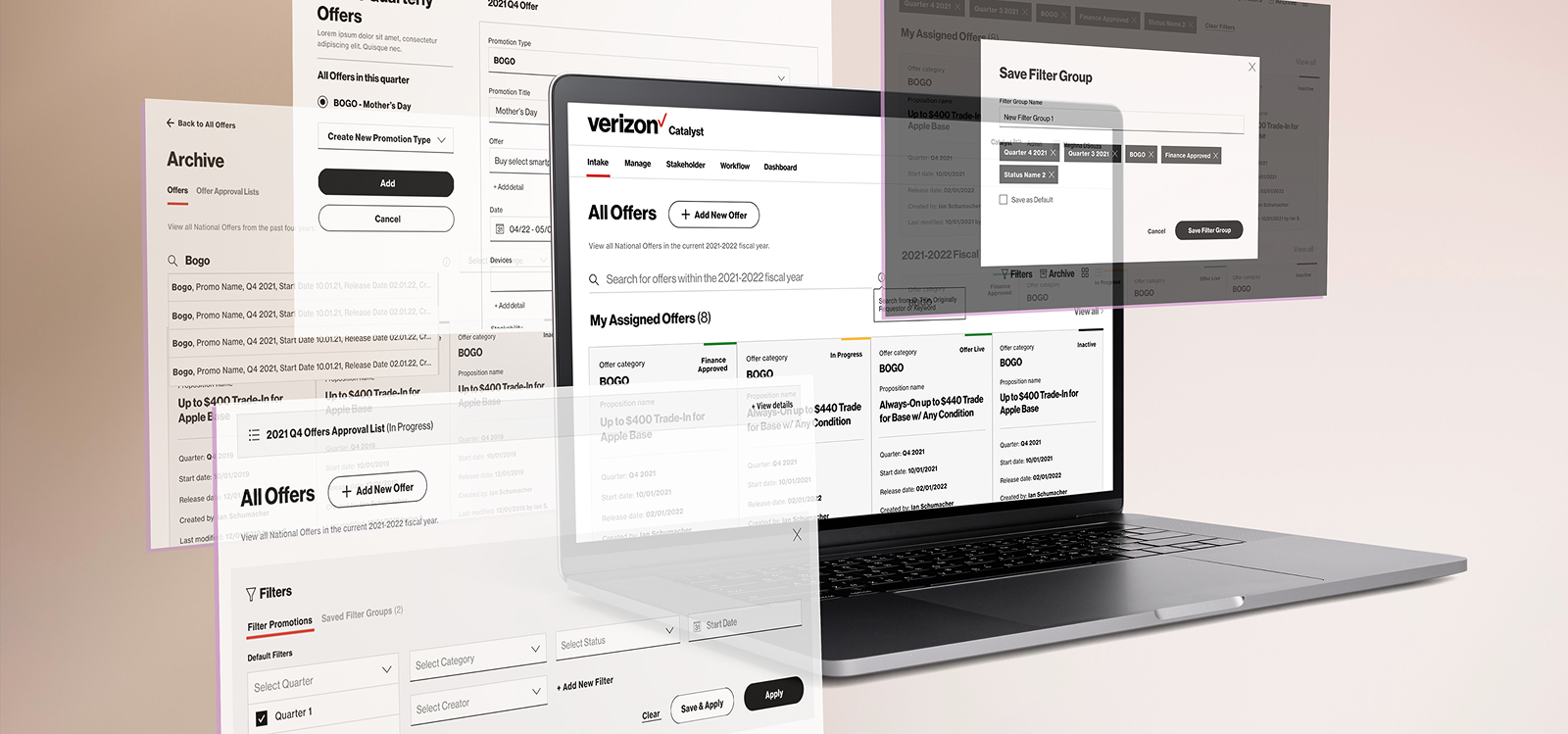
Catalyst Platform (MVP)
Smart Intake Engine
// Replaces Excel
We replaced error-prone Excel sheets with a dynamic digital form. The system uses conditional logic to guide Marketing users, ensuring Finance receives clean, standardized data every time—eliminating the need for manual revisions.
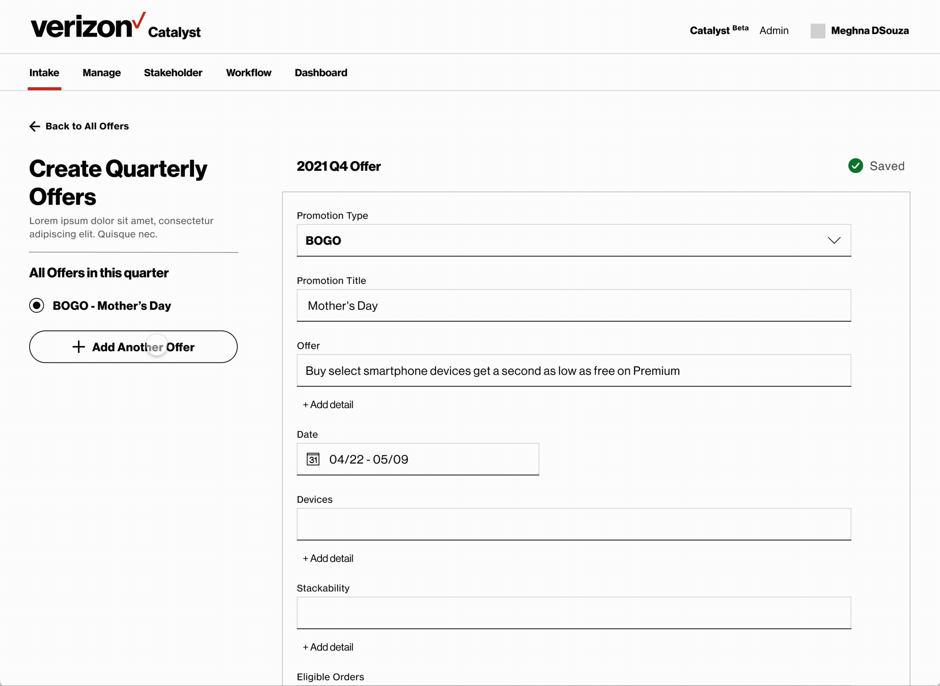
Designed distinct interface states for Requestors (Marketing) vs. Approvers (Finance) to reduce ambiguity and speed up the decision process.
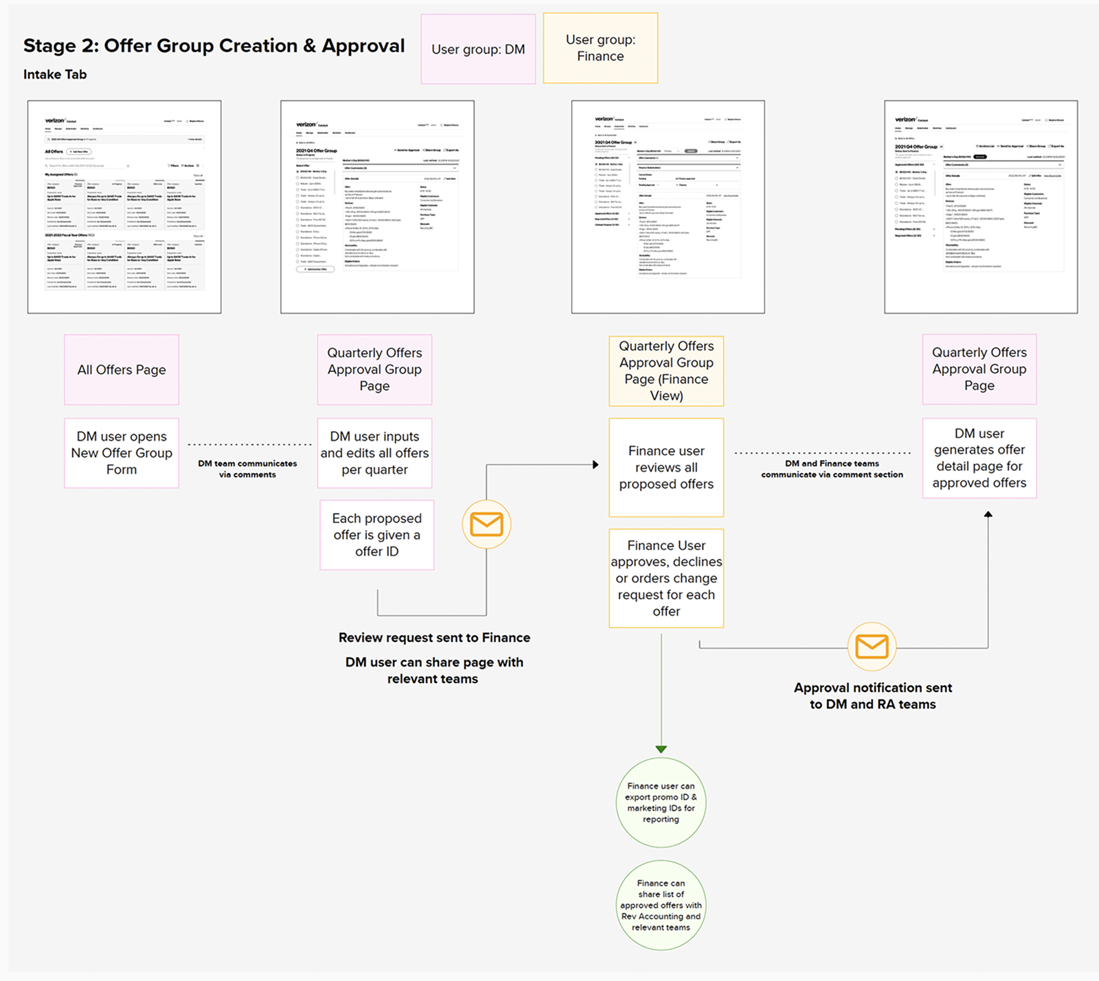
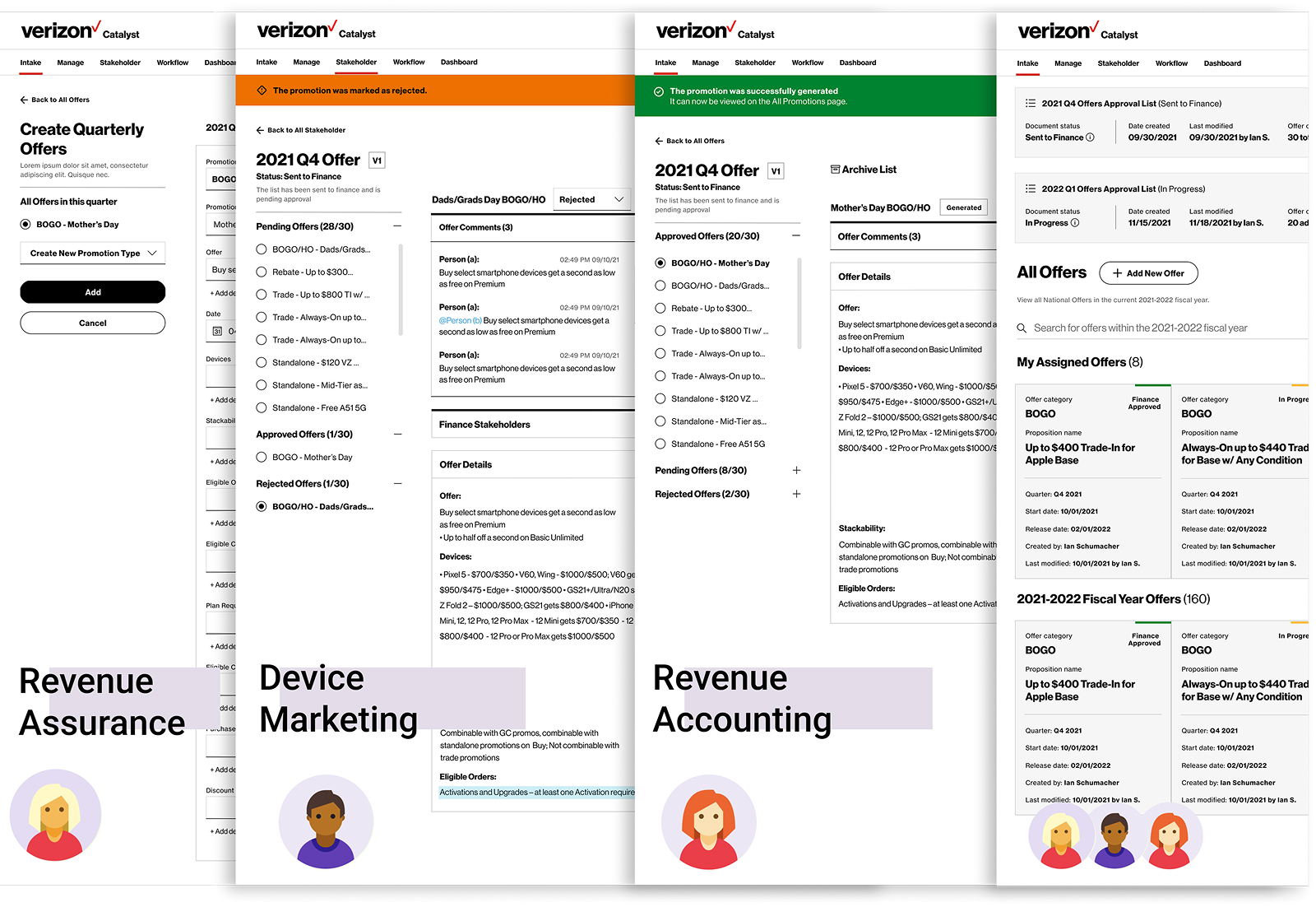
Streamlined Cross-Team Workflow
// Context-Aware System
To address the friction of manual handoffs and "black box" processes, I designed a context-aware system where the interface adapts dynamically to the user's role in the approval chain.
-
Role-Based Views Marketing sees a tracking view (Status), while Finance sees an execution view (Actions).
-
Dynamic Routing The system triggers notifications for the next approver, removing the need for manual email ping-pong.
-
Clear Accountability Distinct UI states ensure everyone knows exactly whose court the ball is in.
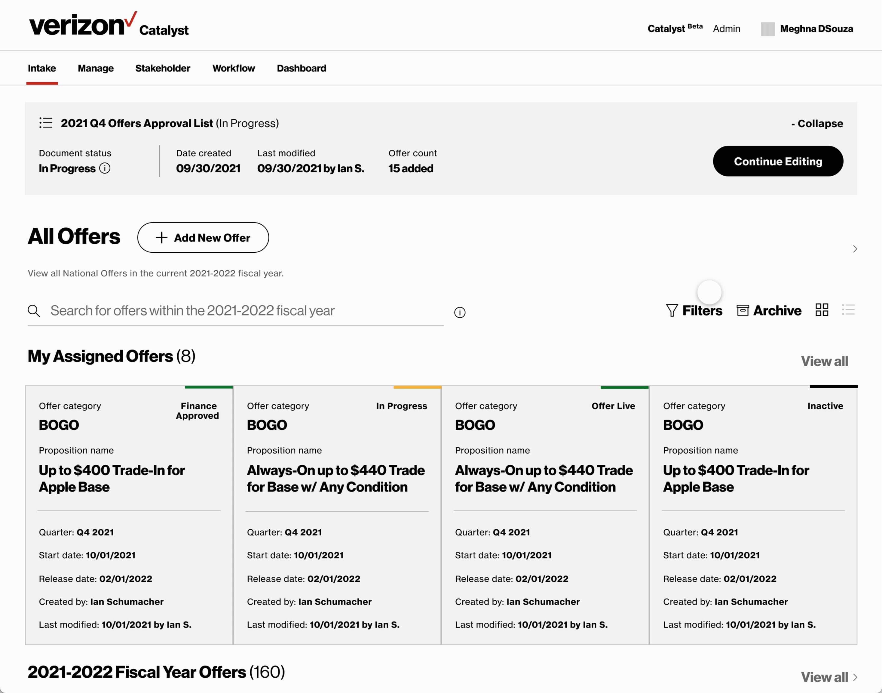
Central Command Dashboard
// Single Source of Truth
A real-time overview. Stakeholders can now track an offer’s journey from Planning to Post-Live instantly. This visibility killed the "Black Hole" effect, allowing leadership to see exactly whose desk a proposal is sitting on.
The Impact
Operational Transparency
Eliminated the "Black Hole" effect. Stakeholders achieved 100% visibility into the offer lifecycle.
Error Reduction
Standardized inputs significantly reduced manual data entry errors, saving the Finance team hours of reconciliation time.
Successful Handoff
Delivered comprehensive specs enabling engineering to build and ship the MVP on schedule.